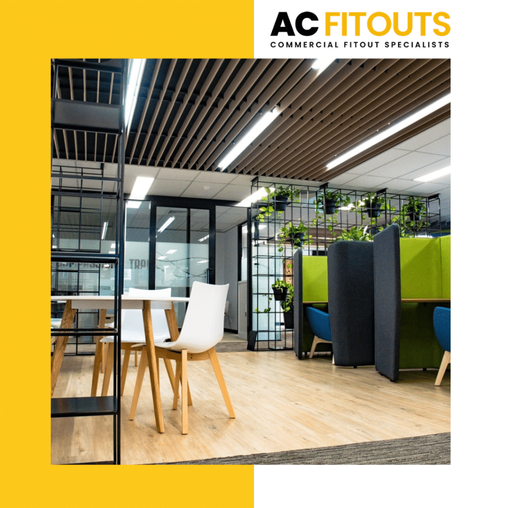
Shop Design, Layout & Fitout have some pitfalls which can easily be avoided.
Here’s 8 more with a focus on the Counter, Display & Signage and Lighting & Electrical.
1. Don’t go for one: style or function. A counter must have both.
Bland, boxy counters are out.
A good counter needs more style than that and plenty of space for your customer to place their belongings as well as their purchase.
It also needs plenty of transactional space to complete a purchase.
A mix of finishes is also desirable rather than using the one material.
2. Avoid having any exposed feet underneath your main counter.
Closed in skirtings are a neater finish and hide excess cables and chords as well.
Exposed areas under counters are hard to clean and look very messy.
3. Never print out and hand laminate signs then stick them all over the place.
This is a big mistake that some retailers make, hoping to save money and attract attention.
Looks matter in the retail shopfitting world. Your business relies on branding everything consistently.
Signs of all types used in your retail space must have the same font, font size, colour way etc, and must be used effectively.
Do not overload your customers with little signs everywhere.

4. Avoid poor signage.
Be very clear about wayfinding in your retail fitout. It’s an important element.
It’s sometimes referred to as the “silent salesman”.
Having your customers easily negotiate a shop adds to their overall experience. Signage showing merchandise zones, dressing rooms, POS points, and so on, should appear uncluttered and very visible.
Imagine you are a totally new customer having to find your way through the shop.
Track and map the journey, knowing where signs need to be placed.
5. Avoid being too “standard” with display and signage.
Display can be much more than rotating racks, basic gondolas and slat walls.
Signage can be more than adhesive letters stuck on a backboard.
Move into better finished display items.
And why not look at signage options like three dimensional letters, internally illuminated letters, backlit metal letters or edgelit acrylic?
There’s so many choices other than “standard”.
6. Don’t settle for poorly lit displays to save power.
Product placement is often thought about so much, but lighting it well so it says “buy me” is another issue.
There are so many ways to light: from above, below, behind and from the sides, so get on board and look into these options.
Spots, tracks, strips, single lights, recessed, exposed they’re all for the taking.
7. Avoid dodgy electrics to save a dollar.
Electrical cabling and power outlets which either hang from the ceiling or are exposed are definitely out!
Power packs running multiple points are also out. They are hazardous as well as being ugly. Ban them!
Call an electrician to hard wire in power points in a responsible way.
8. Definitely don’t go for mismatched light globe colours and types.
Sometimes owners replace a faulty globe with a new one, not taking into account how it matches those around it.
For instance yellowish warm white won’t look the same against a bright cool white, a fluoro lamp won’t match an led or halogen lamp so put together, they’re a bad look.
Take care to maintain the colour rendition of lights grouped together.
It just means looking at your retail space through a customer’s eyes then a bit of planning ahead.
That’s a pretty simple task.


